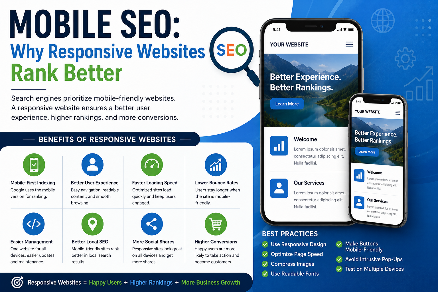
Mobile SEO: Why Responsive Websites Rank Better


Mobile SEO: Why Responsive Websites Rank Better
In today’s digital-first world, mobile devices have become the primary way people browse the internet. From shopping and booking services to reading blogs and comparing products, users rely heavily on smartphones for quick access to information. Because of this shift, mobile SEO has become a critical factor in website success. If your website is not mobile-friendly, you could be losing both traffic and potential customers.
What is Mobile SEO?
Mobile SEO refers to the process of optimizing your website to provide the best experience for users visiting from smartphones and tablets. This includes faster loading speed, easy navigation, readable content, properly sized images, clickable buttons, and responsive design.
Search engines like Google prioritize websites that offer a smooth mobile experience because they want users to find helpful and accessible content quickly.
What is a Responsive Website?
A responsive website automatically adjusts its layout, images, text, and design elements to fit different screen sizes. Whether someone visits your site on a smartphone, tablet, laptop, or desktop, the website adapts to provide an optimal viewing experience.
Unlike outdated fixed-width websites, responsive websites are flexible, user-friendly, and essential for modern SEO.
Why Responsive Websites Rank Better
1. Google Uses Mobile-First Indexing
One of the biggest reasons responsive websites rank higher is mobile-first indexing. Google primarily evaluates the mobile version of your website when determining search rankings.
If your mobile site performs poorly, your rankings may suffer—even if the desktop version looks perfect.
2. Better User Experience
User experience plays a major role in SEO. Responsive websites make navigation simple, content easy to read, and buttons easy to click without zooming or horizontal scrolling.
A better experience keeps visitors on your website longer, which sends positive signals to search engines.
3. Faster Loading Speed
Mobile users expect fast-loading websites. Responsive design often improves loading performance by optimizing layouts and reducing unnecessary elements.
Slow websites increase bounce rates, and high bounce rates can negatively affect SEO performance.
4. Lower Bounce Rates
When users land on a poorly designed mobile website, they often leave immediately. Small text, broken layouts, and hard-to-click buttons frustrate visitors.
Responsive websites reduce these issues, helping retain visitors and improve engagement metrics.
5. Easier Website Management
Managing separate desktop and mobile versions can be complicated and inefficient. Responsive design allows businesses to maintain one website across all devices.
This simplifies content updates, technical maintenance, and SEO management.
6. Improved Local SEO Performance
Many local searches happen on smartphones, such as “restaurants near me” or “digital marketing agency nearby.”
Responsive websites improve mobile usability, helping local businesses perform better in local search results and attract nearby customers.
7. Better Social Media Traffic Conversion
A large portion of social media traffic comes from mobile devices. If users click your social media link and land on a non-mobile-friendly website, they may leave instantly.
Responsive websites ensure smoother transitions from social media to your website.
8. Higher Conversion Rates
A user-friendly mobile experience leads to more inquiries, purchases, sign-ups, and bookings. Better usability directly impacts business growth.
SEO is not just about rankings—it’s about conversions too.
Best Practices for Mobile SEO
To improve mobile SEO:
- Use responsive web design
- Optimize website speed
- Compress images
- Use readable font sizes
- Make buttons mobile-friendly
- Avoid intrusive pop-ups
- Improve page loading performance
- Test website usability regularly
Final Thoughts
Mobile SEO is no longer optional—it’s essential. Responsive websites rank better because they provide faster, smoother, and more user-friendly experiences that search engines reward.
If you want better Google rankings, increased traffic, and higher conversions, investing in responsive web design and mobile SEO is one of the smartest decisions your business can make.